Friday, September 30, 2011

October Promotions

Take a look at the fabulous deals for October!


Click on the flyer to see it bigger.


Promotions valid only during time period specified, no exceptions.

Promotions not to be combined with other offers, discounts or coupons.


Printed flyers are available for pick-up at the store.

Wednesday, September 28, 2011

Kit of the Week!

Everyone out there celebrates birthdays.  So, here is a "Quic-Kit" to record those fun family memories.


Get yours today while quantities last!

Design Team Monday (on a Wednesday)!

The ladies are back this week with a Style Challenge for you!

Naturalist

Pages with the Naturalist style get "back to nature" through earth tones, speckled paper, and monochromatic colors. Naturalist pages often incorporate texture by using handmade papers, fibers such as jute, ripped torn or sanded edges
___________________________

Michele

The Naturalist style is fun and easy to work with. Now is the time to incorporate all kinds of things natural like feathers, leather, cork, wood, paper, old book pages, small pebbles, corrugated cardboard, butcher's string, fabrics, dried orange or apple slices, dried mushrooms, dried beans, small cinnamon sticks, tiny pinecones, etc..

It's time to let our creativity go wild!! Here I found some old left over wood plugs for wood floors, they weren't too thick... perfect for my layout! I was also rummaging for a feather, I never found it but I came across some old eucalyptus that remained rubbery, it worked out pretty good, the colour is just what I needed. A really fun project for a very touching photo...


Papers: Bo Bunny - Welcome Home Collection and Bazzill cardstock
Inks: Green and Teal Chalk Inks and white pigment ink pen
Ornaments: Bo Bunny-Welcome Home collection Chipboard, Jute and twine, eucalyptus, cork bird and flower, wood floor plugs, molded half circle, brads and eyelets.
Tools: Swiss Cheese EK Success punch and QK «Central Park» Alphabet
___________________________________

Julie


Products used:
Bo Bunny diecuts
My Minds Eye Burlap
Misc: twig, raffia and embossed cardboard (Starbuck's coffee sleeves)


Saturday, September 24, 2011

Inspiration from the Blogosphere!

Halloween is just around the corner so when I spotted these adorable treat boxes over on the Scor-Pal blog, I just knew I had to share them here.

A Black Cat Treat Box


Gina used the Square Treat Box tutorial from from the Scor-pal website and added a cat rosette that was inspired by a home decor project from Martha Stewart.

To make the cat rosette, cut 2 pieces of black card stock, 1.5" x 12". Score every half an inch and pleat fold.


Attach the two strips together with Scor-tape to form a circle. Press the circle down in the center to form a rosette, and glue in place.


Add pieces of card stock to decorate the face. Apply glue to the eyes, ears and mouth of the cat. Cut a small piece of U Cut It Foam (Stacked pop dots could work as an alternative), and fill in the hole in the center of the rosette. Color orange with a copic marker.


Make a loop of metallic thread, and tie a knot in the center. Clip the ends to make whiskers. Place this on the UCutIt Foam (pop dots). Glue the nose over the top.


Complete the Square Treat Box, following the tutorial, and add the Scaredy-Cat to the top of the box.

Here are a few more views of this fun project:


Friday, September 23, 2011

The fall issue is here!


Available today is the Fall issue of Scrapbook & Cards Today

Stop in today to pick yours up (wile quantities last)!

Thursday, September 22, 2011

DT Special Assignment Day!

Picking your Papers

by Julie Gillespie

What papers should I use?!?!

I have found that this is one of those issues that scrappers sometimes struggle with – what papers should I use? Can I really put this pattern with that one?

I have to admit that my scrapping friends think that I have a knack for grabbing papers for a layout that they would never think of putting together and then marveling at how well it works. And I also have to admit that this is one of my favourite parts of scrapping…looking through my paper and finding great matches!

Of course, one of the easiest ways to do this is to buy coordinating papers from a specific line designed to mix and match. But even so, some scrappers hesitate to really mix it up when it comes to pairing different patterns together. So what do I look for when doing this?

I start with picking out a consistent colour, usually the one that I want to coordinate with my embellishments. Then I look for papers that have this colour in common. You can also choose different shades of the same colour (light to dark) when picking your papers.

This one was easy – pinks, browns and light greens. Polka dots, paisleys and florals - two of these papers came from the same line, but the other two were pulled from my stash. In addition, I paired it with a die cut that had the same light green on it, as well as polka-dots to tie in with the brown on white polka dot paper.


This one was a little more complex – lots of colours to choose from. Two floral patterns, polka dots and stripes! This time, using solid colours and ribbon between the different patterns helps to make it work.


This next one had even more patterns incorporated into it – plaid, diamonds, circles, stripes and geometrics. All had the same colours in them – brown, blue and a rusty orange. By separating each pattern with the solid brown the patterns don’t clash. (Although this paper came from a 6x6 stack, you can get the same effect using your own individual papers.)


Yes, size does matter! The size of your patterns also factors into how well pairing different patterns will work. Florals are usually the hardest to pair up. If you are looking at pairing two different florals , try picking one large floral with multiple colours and then a smaller floral in one colour only that matches the overall colour theme you are going for. Your embellishments would most likely be in that colour as well to tie it together. Small polka dot patterns work well with many other patterns, again, keeping them to a single colour works best.

Stripes are another of my favourite patterns to use as they provide a great way to introduce not only your “theme colour” but also the other colours that are used on the layout. I usually try to pick a stripe that has a wider band of my theme colour, with the smaller stripe bands in the secondary colours of your layout.

Choosing a two colour theme is another way to easily pick multiple patterns for your layout. Think black and white! This is a perfect colour combination to mix and match with…try pairing a paisley pattern with stripes and polka dots. Don’t forget that your papers can be black on white or white on black, giving you different effects on your layout.

The bottom line is, don’t be shy…don’t be afraid to mix it up a little!

Wednesday, September 21, 2011

Kit of the Week!

This week's "Quic-Kit" uses the super adorable new line from Simple Stories - Baby Steps.  The ladies at Fruit & Nut have used this yummy product to put together a gorgeous layout perfect for any new little ones in your life.


Stop by the store and get yours today!


Monday, September 19, 2011

Design Team Monday!

This week, the team is playing with their Crafter's Workshop templates.  If you remember, these are our Product of the Month and are 15% off for the remainder of September.

Virginia

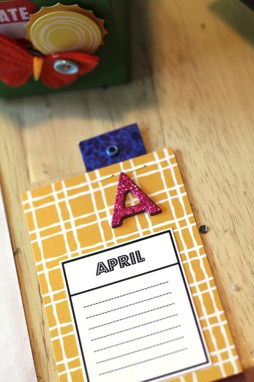
For my technique I used the templates as a template for bling - but I was worried that with just the templates alone you wouldn't be able to tell that it was a leaf design so I first went over the templates with a bit of smooch mist in a colour that was very similar to my cardstock colour.


Supply list:
PP - Bo Bunny Forever Fall
Letter stickers - Sassafrass Lass
Stickers - Basic Grey
Bling - Kaiser
Embelishments - Bo Bunny, American Crafts
Washi Tape - American Crafts
________________________________

Michele

So what do you do with the Crafter's Workshop templates?

We are only showing a few examples here, if you use your imagination, you can get a LOT out of your templates!! In my example here, I wanted to emboss the beautiful swirls from my Capricious Crafter's Workshop template because I wanted them to stand out and to look luxurious. This wild turkey that was in our yard earlier in the season was such a majestic bird, I had never seen one this closely and I wanted to give it justice.

I did not have forest green embossing powder. No problem though because I have super thick CLEAR embossing powder so I used a forest green Cat Eye's pigment ink with the template and with the melted clear powder over it, it gave me exactly what I wanted. I liked it so much that I inked the outer edge of my background with the same dark green pigment ink and added the clear embossing powder to emboss that too!! I had fun!!

So remember, I have been saying this for months with several projects: stock up on white and clear items, they always help get you out of a bind when you don't have the right colour!!


Papers: Bo Bunny - Welcome Home Collection
Featuring the Crafter's Workshop template - Capricious
Inks: Copics for the photo frame, brown and white pigment ink pens for the text, forest green pigment ink for embossing with clear thick embossing powder
Ornaments: 4 Bo Bunny - Welcome Home collection Chipboards, alphabets, flowers and a brad, leaf and ribbon
________________________________

Julie

I used my Crafter's Workshop Template to create a background on black cardstock. I sprayed it with copper Glimmer Mist (it came out a bit uneven, but I kind of liked the look of it). Then I used a white gelly roll pen to draw some zentangles in a few of the diamonds. I also used the template to cut a few pieces of paper to add to the diamond pattern.


Products used:
Bo Bunny Father Christmas papers
Bo Bunny Father Christmas die cuts
Crafter's Workshop template - Harlequin
Ranger inks, white gelly roll pen and copper Glimmer Mist
Misc: black cardstock, ribbon, buttons 
__________________________________

Cherie

For my layout, I put the template down on my background in the upper left corner and lower right corner and inked over the template.


Patterned Paper: Bo Bunny Blitzen
Letter Stickers: Doodlebug Design
Die Cut Letters: Quickutz Silhouette
Brad: Bo Bunny
Die Cuts: Bo Bunny & Jillibean Soup

Thursday, September 15, 2011

DT Special Assignment Day!

Patchwork Backgrounds and Ranger's Distress inks

by Michele (Mimita) Harris

You asked for it!! You wanted more paper techniques and this is a very simple one which makes a fun background for layouts and cards: Patchwork!! And I am also showing you how to use the Distress inks from Ranger. The little bottle is refill ink for the pads. So if you buy a pad and it goes dry, you only need to add a few drops of ink onto it and it's like new again!!


Wednesday, September 14, 2011

Inspiration from the Blogosphere.....

I have a large family and with that comes many birthdays!  I do pretty well but I just can never remember them all.  Then, I saw this project over on the American Crafts blog.  Such an awesome idea and definitely one I am going to try out for myself.
___________________

Mini Birthday Calendar


Supplies: Havana Paper (35435) - Margarita, Mariachi Paper (35440) - Margarita, Tamale Paper (35434) - Margarita, Guacamole Paper (35437) - Margarita, Printed Variety Tags (85521) - Bits, Printed Long Variety Tags (85553) - Bits, Macaw Taffy (53189) - Thickers, Retreat (42200) - Remarks, Getaway (78050) - Details


1) I first started by choosing four patterned papers out of the Margarita line. I printed out some blank calendars that I put together which you can download and print right here.


2) I cut all the calendar pieces and left a small white border.


3) Next, I cut the patterned paper pieces to 3.5x4.5".
 

4) Then I adhered the calendar piece towards the bottom half of the patterned paper.


5) I wanted to add a little tab at the top of the calendar pieces so I used some of the Bits variety tags and stapled them to the back of the patterned paper.


6) To finish up, I added some glitter Thickers that match the corresponding month.


7) Here they are all finished!


You could bind these with a jump ring, or sew them together, but I found something that fits them just perfectly. It is a box from Starbucks that holds those yummy cake pops. I only used the bottom portion. It fit the cards perfectly! I just added a few embellishments to finish it off.


Tuesday, September 13, 2011

Kit of the Week!

A new week means a fabulous new "Quic-Kit" from the ladies of Fruit & Nut.

Check out this week's beauty.....


As always, these are of limited quantity so get your today!

___________________________

Here also is a peek at September's Calendar layout.....


Monday, September 12, 2011

Design Team Monday!

This week the fabulous Design Team ladies are bringing you a sketch challenge.

Michele took 2 sketches from Lutine and changed them up a little to make one double-page sketch.


And here is what the ladies did with the sketch.....

Julie


Products used:
Bo Bunny Father Christmas die cuts
Misc: cardstock; letter stickers; rub-ons; raffia
________________________________________________

Michele


Papers: Bo Bunny - Welcome Home Collection, Bazzill cardstock
Inks: Dark brown Chalk Ink and brown and white pigment ink pen for the text
Ornaments: Bo Bunny Welcome Home collection Chipboard, alphabet, flowers, buttons, white brad, feltie bug; decorative pins and brown dew drops 
_____________________________________________

Virginia


Supply list:
Bazzill cardstock
Bo Bunny Forever Fall Patterned Paper
Letter stickers: American Crafts, Making Memories, Sassafrass Lass, Basic Grey & October Afternoon. 
_____________________________________________________

Cherie


Cardstock: Bazzill Basics
Patterned Paper: Bo Bunny Blitzen
Die Cuts: Bo Bunny Blitzen
Title: Quickutz Silhouette
Brads: Bo Bunny Blitzen