Sunday, July 31, 2011

Open for business!!


Just a reminder - we are OPEN for the Civic Holiday tomorrow.

10AM - 6PM

Pop in and see us!!


Friday, July 29, 2011

New Product in Store

You've never seen anything like this before! Twirl your way to amazing 3D designs with these EK Tools new Dimensional Punches. These flowers truly jump off the page! Simply punch like a standard edger and twirl to create dimensional flower designs or leave flat to use as a standard edge design.
 These fabulous punches come in 4 different designs and all of them are available in-store now!!

Dahlia Dimensional Flower Punch

Doily Petals Dimensional Flower Punch


Gerber Daisy Dimensional Flower Punch


Carnation Dimensional Flower Punch


Want to see them in action?!?!  Check out this video.....

August Promotions

Did you take advantage of the deals on the July Promotions Flyer??

Want to do that again in August?!?

Check out the new flyer and be sure to pop in and take advantage of these fab deals!!


Click on the flyer to see it bigger.

Promotions valid only during time period specified, no exceptions. 
Promotions not to be combined with other offers, discounts or coupons.

Printed flyers are available for pick-up at the store.

Thursday, July 28, 2011

DT Special Assignment Day!

This week it is Julie's turn to share some inspiration with us.  She has an article sure to help you find the perfect title for your layout.
______________________________________

Writer’s Block!

Sometimes just the thought of coming up with a title for a layout can reduce even the chattiest person to having writer’s block. I hope that this little article will give those of you that struggle with titles and journaling some things to think about that will help you.

Choosing a Title:

One of the first things I do when looking at photos I want to use on my layout is actually to think about what words or emotions come to mind when I look at the picture. Sometimes, a comment from someone else is also helpful. For this one, my DD said “he looks like a little James Bond”, so that started me thinking about the whole layout and “James Bond ain’t got nothing on me” became the title / journaling. Just as we scraplift layout ideas, don’t be afraid to turn to quote books or to google ideas for “scrapbook titles”. “A Star is Born” is an example that could work on any number of layouts, from a baby in sunglasses, to a small child in his/her first school play, to an adult singing karaoke at a party.

Layout by Julie Gillespie

The title should give your viewers an idea of what the page is about and should tie the theme of multiple photos together, much the same way as the choice of your embellishments does. The style of your layout will also dictate somewhat what your title might be (a vintage page probably wouldn’t lend itself to a cartoon title for instance).

Your title can reflect the actions going on in the photo (i.e., slide, smile, roar) or the emotions you feel when looking at the photo (i.e., perfect, gift). Whether or not you choose to use any other journaling on your page, you title should convey what the layout is about.

Layout by Janie Boots

Layout by Tanya Caple

Layout by Bev Code

Layout by Tammy Spruce

Other sources of inspiration include song lyrics, poems, puns, favourite quotes, even famous movie lines. Just remember though, that simple is sometimes better and a title that reflects the date, time, place or event is often the best choice for your layout.

Layout by Michele Harris

Title Placement:

OK, so now you’ve chosen a title and have to decide where and how to add it to your page. Think outside the square layout! Your title can add as much or more interest to your layout as any embellishment. It doesn’t necessarily have to be placed at the top or bottom of the page. Perhaps your layout includes a wavy line….can the title also follow the wave pattern? Titles can be split to show up on 2 different parts of your layout, or can be placed around an object on the page. A title on an angle that follows an embellishment also adds interest.

Layout by Julie Gillespie

Layout by Julie Gillespie

What is Your Title Made Of?:

The title also doesn’t have to be in all the same font or size. Using one of the words of the title as the focus and making it larger will bring the viewer’s attention to that word. It would then be followed by the rest of the title in a smaller font. A longer title can be shortened by using a small font for the “little words” (at, be, and, etc.) or numerals instead of spelling out numbers (11 instead of eleven). Embellishments can be used to take the place of the dot of an “i” or of an “o”. String or ribbon can be used to create letters. Doodling or zentangles can be used to create letters. The font itself can often convey a sense of the emotion or action of a page. Is your page playful and colourful? Then you may want to use block lettering in complimentary colours. Is your page vintage or romantic? Then a script font might look best.

This sketch challenge thread shows several good examples of different fonts and title materials.

Layout by Michele Harris

Layout by Tracey Gordon

Layout by Shelley Scheeringa

There is lots of great inspiration on the Scrapping Turtle gallery! There is a lot of talent in the ST pond - don't be afraid to try something new or to push the envelope when it comes to your titles and journaling.

Wednesday, July 27, 2011

Tutorial

I came across this tutorial this morning on the Studio Calico blog and I just had to share it.  This confetti technique would look fabulous on layouts and cards!!  And of course you can achieve this look by using any paper you may have on hand.

This tutorial reposted here with permission from April Foster.


Confetti images have been so popular lately on my Pinterest feed, that I thought I would try to carry over the trend to a scrapbook layout.  To do that, I used a fairly neutral background.


Cover your background with a layer of Mod Podge.  When choosing your background, it’s best to start with a size larger than the final size you’d like.  Here, I didn’t need to cover the edges with Mod Podge since it’s larger than I needed.


Next, I used my swiss dot punch on a piece of patterned paper.  While punching, I held it over my background so as the circles fell, they would stick to the Mod Podge in a random arrangement.


Supplies: Cardstock (Bazzill); Patterned Paper (Studio Calico); Veneer Button (Studio Calico); Fabric Brad, Metal Pieces, Seam Binding

Tuesday, July 26, 2011

Kit of the Week!

Summer time equals Soccer time!!!  So many of us have little ones who run the fields during the summer months so this week's "Quic-Kit" is perfect for that.


Monday, July 25, 2011

Design Team Monday!

The ladies are back with a Style Challenge for you this time around.

Urban Chic

This style is for the urban jungle types. Urban Chic is all about "glam". Bright colors, jewels, sparkles, glitter, shiny metals, pen outlining, sequins and other sparkles are prominent elements. The presence of black and white paired with bright colors is practically a must. Urban Chic often has heavily inked edges and is often on white backgrounds. Some stitching can be spotted in this style. You may also find shiny glass or plastic in nice, neat shapes. You may spot minimal doodling and pen outlining, but the Urban Chic is not the do-it-yourselfer, she'd rather add sparkles than doodles. Think big city, bright lights and noise. Think party girl. The Urban Chic is a fun time.

______________________________________

Julie


Products:
Misc. border, ribbon and gems 
______________________________________

Virginia


Supples:
October Afternoon Stickers
Maya Mist, Smooch Mist
Bazzill Cardstock
Versamark ink
Studio Calico stamp 
________________________________

Michele


Papers: BoBunny Zoology collection and white Bazzill
Inks: Black chalk ink, black pigment ink pen, Black Copic for the button coloured in a «zebra» pattern and Yellow Copic for the 3 pins and the Bling
Ornaments: Bo Bunny Zoology collection chipboard and stickers, Prima flowers, transparencies, white buttons, lace and black sparkly buttons.
Tools: Edge stamp 
____________________________________

Cherie


Cardstock: Bazzill
Patterned Paper: Bo Bunny Barefoot & Bliss
Stickers: Bo Bunny
Letter Stickers: American Crafts & Doodlebug
Chipboard: Fancy Pants

Thursday, July 21, 2011

DT Special Assignment Day!

Alright, I am back on track and all caught up now!  So, here is this week's Special Assignment brought to you by Michele.
________________________________

A Christmas Mini

by Michele (Mimita) Harris

First off, this video is 38 minutes long.

In making this video, my goal was to give beginners a sense of direction as to where to begin in making a mini photo album. I also wanted to share tricks and ideas and so, I turned this mini into a Brads’ Special in order to offer content to the more advanced crafter as well. Hopefully; it can inspire everyone.

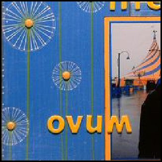
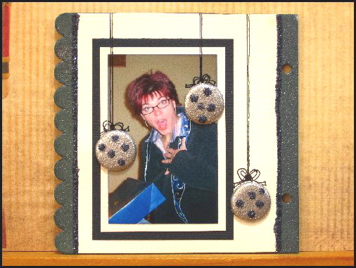
I added still images of the finished mini at the bottom of this post, so that you can see the detail of each page.

On a side note: When I say it’s difficult at the very end of the clip, I am not referring to the task I am doing (which really is easy!) I mean that it’s difficult to focus on what you’re doing when you have a camera watching your every move!! LOL

The Content:

3 short Chapters on where to begin:
- Base and photos
- Explore 4 colour mediums
- Paper and ornaments

3 short Tutorials:
- Easy matting
- i-Rock Tool and gems
- Embossing Brads

12 Ways of using Brads

The complete mini

Click Here to View The Video Titled: A Christmas Mini

While it is not shown on the video, I will protect my mini with 3 coats of clear acrylic sealant. This is important!! It will protect the mini from any kind of stains. Moreover, anything embossed is fragile (it can chip if you’re not careful in manipulating your mini) and sometimes excessive heat will cause the glue, used for papers and ornaments, to melt. For example, if the mini was left in the car on a hot summer day...
________________________________

More Brad ideas!!

Hold Transparencies with Brads:


Cluster Brads to create an area of interest:


Another Brad Frame:


Doodle a fish around a Brad:


Make a Bug with Brads:


Use Brads to emphasize a colour and add texture on a background:


Another Circle made of Brads:


Accent Paper Patterns with Brads:


Last but NOT least (it’s my Favourite!!!): Doodle an apple with a Brad:
Brought to you by Guest Artist: Julie Gillespie, DT member for Scrapping Turtle
 

Check out Julie’s work on Scrapping Turtle’s Facebook – Blog – Forum
She is very talented and creative! So are my other teammates of course!! But I so fell in love with this little apple, I just had to show it here. Many thanks Julie for letting me!!!!
_____________________________

The Finished Mini


Special Thanks to my husband Jeff who filmed, directed, edited, stayed up late and made all this possible!!

Special Thanks also to Julie Gillespie, my guest artist!!

Wednesday, July 20, 2011

DT Special Assignment Day!

Due to an extended visit at the cottage I am being with my Turtle blogging!  So sorry about that!  It was worth the rest & relaxation though!  ;)

Here is Virginia's Special Assignment for you.  Check out what she has to say about making your titles really pop off the page!

_________________________________________

I don't know about you but I often find myself partway through layout only to realize I've been so busy creating that I haven't left space for my title!

With this layout I added the title inside one of my design elements. It was easy to do and I think it really adds to the "cute" factor of this baby page.

Here's how:

I made a button heart and then added my title inside - I used a heart but you could re-create this with any shape and could go beyond buttons do do it with brad or other bling your page (brads, etc)


To re-create this on your next layout simply sketch the shape you want with a light pen or pencil and then go around the shape with glue (I used glossy accents) - I suggest laying everything out dry on your layout and making sure you're happy with the positioning before going around with glue and sticking everything down.

And that's it!

If you try this technique, we would love to see it so be sure to link up your projects here or load them up on the forum!

Tuesday, July 19, 2011

Design Team Monday (a little late)

For our technique this week, the fabulous DT ladies are playing with the i-rock tool from Imaginisce. This tool is easy to use, lightweight and inexpensive! A scrapper's dream!! Pick one up today and bling up your projects to your heart's content!!

Cherie


Patterned Paper: Bo Bunny Barefoot & Bliss
Stickers: Bo Bunny
Jewels: Imaginisce
Die Cut Circle: Jillibean Soup 
______________________________________________

Julie

I chose to do a mini album because I had so much gorgeous paper left over this month.

Placing the metal studs with the iRock:

Mini cover: 

I added some more studs to the bikini on this tag: 

I used one of the transparencies to hold this tag: 

It's hard not to get carried away adding bling with the iRock!:  

I added one of the plastic keychain embellishments to the final tag and backed it with a pink piece of paper in the same shape. 

Products used:
Fancy Pants Glitter Cuts transparencies
iRock white metal studs
misc flowers and ribbons
white cardstock 
___________________________________

Michele


Inks: Black chalk ink, pigment ink pen and felt pens
Ornaments: Bo Bunny Zoology collection chipboards and stickers, i-rock gems, Maya Road clear ribbon
Tools: Embossing folder and Prima masks 
______________________________________

Virginia


Stickers: Fancy Pants
Jewels: Imaginisce
Felt stickers: Sassafrass Lass
Letters: Basic Grey
Label Stickers: Studio Calico